Behind the Guard

The blog behind the man behind the mice.
Introduction: I am absolutely enthralled with David Petersen and his work on Mouseguard. Such an innovative series in a myriad of ways, and it is completely deserving of all the critical and commercial success that it has received. I could go on and on about my favorite components of the Mouseguard series, but this article will actually be dedicated to something slightly different. I have found the information presented on David's blog to be utterly invaluable. The sheer volume of content alone is reason enough to make frequent stops here, and I can assure you that quality is also radiating from each and every post. This article will focus exploring and discussing three of my favorite posts from the David's blog, which I would encourage you to check out if you are not already an avid follower.

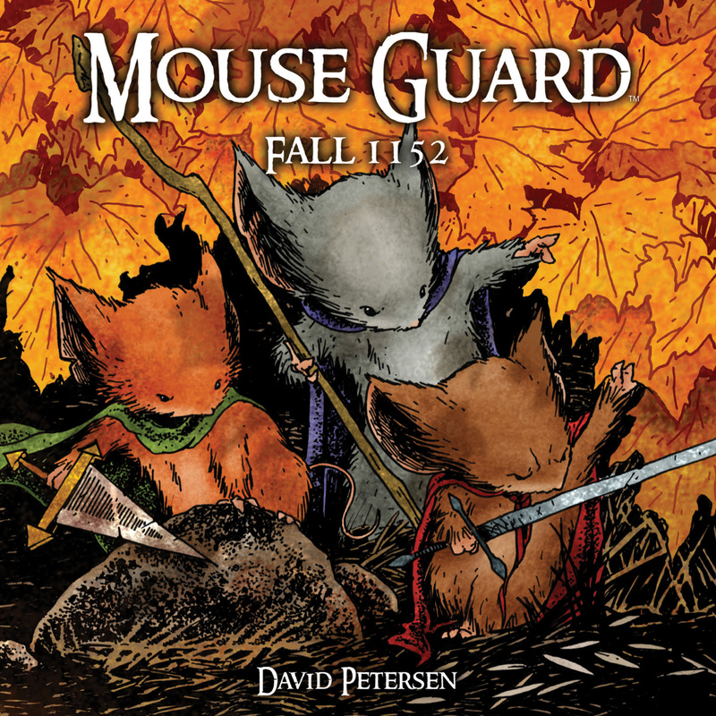
1. Mouse Guard - Winter #3 - Page Process
|
TUESDAY, FEBRUARY 26, 2008
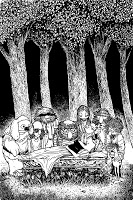
I wanted to share a bit about my process. I am usually bad about saving artwork in-process, but recently I made sure I grabbed a few pieces every few steps. The page I'm going over is page 19 from Winter 1152 #3 (if you haven't read it yet, you may want to wait to read this blog entry!) 
Step1: The Outline/Script.
For Fall 1152, I worked almost exclusively from an outline. I would finish the art then script the dialogue in-place having a good idea of what I wanted the characters to be saying. Sometimes it worked out great, other times, it proved to be daunting and frustrating. So for Winter 1152, I still start with an outline, but now I also do some scripting before I draw. For Winter I sometimes write out a complete script for certain scenes, or jot quick ideas. Too often had I thought of the structure of the dialogue for the page, and later when the time came to add the words, I'd have forgotten them, so any ideas I have about dialogue I write them as soon as they hit me. For this page the dialogue was quick and idea-oriented. I marked the lines with 'A' and 'B' to note where on the page I thought those would be used. The 'lantern breaking' I originally planned for the next page, but for the final version, it occurs on this page. 
Step 2: The Sketches & Layout.
This is the step that feels the most like 'work' for me. It's a balancing act 'of which panel arrangements work best with the secession of actions I need to show on this page?' I tend to divide Mouse Guard pages on the 1/3 lines of the page, so I have a standard 'set' of layouts I can choose from and play with. The trick is to use the right shape panel to match the motion or viewpoint, or grouping of the characters, or at least to not have the two be in conflict. I try and imagine the panel I think is most important on that page (in this case Saxon riding the bat in the first panel was the one I focused on) and then work around that. I sketch everything for a page in a sketchbook or on scrap paper. I try and focus on one panel at a time, sometimes even drawing separate elements from that panel and then composting them together on the computer later. Once I have sketches done for each panel, I scan them in and resize, rotate, and paste them into a page layout that matches the finished page size (12" x 12") 
Step 3: Pencils.
I print out the sketches in the layout and use a light-box to transfer the page onto my Bristol. I clean up the image as I go, being more careful about contours & tangent lines. I like working this way because when I work on a drawing over and over on the same sheet of paper, I tend to get it very smudgy and dirty (which can work well when I'm rendering something in pencil, but not for inked work) This way, I have the minimum of pencil on the final bristol page and was able to work out all my erasing and re-drawing and fixing on the sketch paper or on the computer. 
Step 4: Inks.
I ink with Uni-ball Vision pens. They are waterproof and lightfast. For larger fill-in areas or textures like the bats wings, I use a '0' brush and Speedball Superblack ink. This is where the page starts really taking shape. I add the textures at this point, play with line weights, and fill-in the black areas. This part is one of the most enjoyable for me (sometimes overtaken by coloring). It's something I can work on most anywhere, so I can sit with my wife while she watches TV, or I can take it with me to coffee shops, or conventions. 
Step 5: Colors.
I color using Photoshop 7. Once I have the colors 'flatted' (establish what areas are what colors using just flat color) I only use the 'drybrush' brush for the dodge, burn, and paintbrush tools. I also found that adding 'color holds' (areas where the linework takes on a color) helped add depth to my work on Mouse Guard and now it's something that I think about as I'm inking the page "What gets 'held' on this page?". Originally I was worried about coloring Mouse Guard, not because I couldn't imagine the world in color, but because I was having trouble meshing my inks from Issue 1 of Fall with the colors. Ever since I found the right 'blend' I have really enjoyed coloring and pushing my work in ways I hadn't seen it going before I started Mouse Guard. 
Step 6: Dialogue & Sound Effects.
Lastly, The dialogue is added. For this page, I went back to the method of writing and tweaking it after the artwork was done. I know Saxon's line in panel 1 was one that I came up with in the shower (where a great many of my better ideas come from). The idea to have the bats 'echo' one another was one that I had from the beginning, but hadn't noted it on the script. I am frugal with sound effects. I think there are a lot of them in comics that are either unnecessary or draw you out of the story because it looks like some clean type slapped on in photoshop. Here I had to have a crashy-hissy-burney-sizzly sound...bat flambe anyone? -------------------------------- So, that's a walkthough page 19 of Winter Issue 3. Hope everyone enjoyed this and it wasn't too boring. At some point I'll try and record more steps in the coloring. |
Just as a little context, in 2008 I would have been a freshman in High School.
Anytime that an artist dives into their creative process, I am all over those types of posts. Processing how someone else goes about their work can be extremely insightful. I work in a similar fashion when I am creating my own comic books. I try and have the dialogue fit in last, so that it does not take over the storytelling too much. I want to think art first, dialogue second. I hope that this format continues to work for me! Starting with an outline and scripting might be an interesting way to change up my current workflow. I can see how forgetting some points that you may have wanted could be a problem. Keeping ideas and information accessible is important, however that has to look for you be sure to have that process. Amazing sketches, I love how the story reads right away. This page has a lot of action, and the dynamic angles of the characters framed by the rectangular panels is brilliant. David is not the only artist who I have heard make this claim. This is the stage where the storytelling becomes most clear, and thus should take a considerable amount of effort to depict. Building a set of layouts to draw from is a solid idea, I should invest into a system like that. Since I print out each panel onto a single page, there would be no reason not to create a little library of panel types to draw from. This method is right in line with that of the Computer Paper Project! That is so cool to read for another artist's perspective! I am in this phase right now, and there is a lot of computer work involved. To me, sometimes it feels as though this is not a highly creative process. However, there is without a doubt an art to formatting your page. I have always considered working with a light box more. I do not currently have a set up for this, but I am interested in saving my pencils. Having an original copy of both the pencils and inks really makes each piece feel like an artifact. Each one of these steps is so vital to the creation process, and they are all worth saving. This is an extremely important fact to keep in mind. Minimal pencil on the bristol (or computer paper) always bodes for a better time inking. I have never used one of these pens before, but I do enjoy the look of Dave's inks. As far as I am concerned, whatever pen you need to use to make your inks work is the pen you should go with. Dave has such a strong understanding of texture, and that is something I will surely be looking to incorporate more into my own work. This is a nice point, that I am glad Dave points out here. Creating a comic takes a lot of time, so I am always looking for avenues and steps during the process that allows for me to spend more time with my wife. If I am inking, I can normally do a fairly decent job multi-tasking. This is a skill that I am still trying to work on. I know that there are times when the color needs to go over the black ink, but recognizing and executing those choices can be difficult. A good rule of thumb that I try to look for comes in the form of special effects. Lightning, fire, energy blasts. These are all pretty safe choices for adding color over ink. Enjoying the coloring phase is really important for someone working on their book by themselves. Color can easily make or break a comic, but If handled properly it can elevate the story to the next level. For me, this is a point where I really need to focus on what I am doing. Proper lettering is critical to creating a professional looking book, but by virtue of it being the last phase it can sometimes be overlooked. I really like how Dave letters Mouse Guard, and pays careful attention to sound effects. We could all stand to learn for the expertise he shows in this area. |
|
TUESDAY, NOVEMBER 17, 2009

Square Format:
When Mouse Guard first came out, one of the things people noticed about it right away was it's odd format. There were folks who loved it for being different, and folks who hated it because it was hard to store or display. And while it was an unusual decision on my part (and Archaia's willingness to publish it that way) it seems that the square format is becoming more popular with titles like Dear Dracula, Stuff of Legend, & the upcoming Archaia Fraggle Rock comic. 
There have been unusual format books before Mouse Guard, so be sure I'm staking no claim on the idea. Though I had never seen another square comic until I started Mouse Guard...or so I thought...
As a kid I had a Muppet comic called Muppets at Sea. It was lost at some point and a few years ago I remembered it and tracked it down on ebay...only to find that it was an 8" x 8" square comic! The panel borders even tend to be divided on the 1/3 page lines. I have no clue if the residual memory of this book (I didn't own a copy when I started Mouse Guard and hadn't seen mine in a decade) influenced my format or not, but it was fun to see the commonality. 
My path to square started with the idea of mini comics (comics made by folding standard copy paper in half). To stand out, I had the idea of using legal sized copy paper (8.5" x 14") instead of the traditional letter sized paper (8.5" x 11"). This would give me something different without increasing my costs like colored paper stock or color printing would. The resulting mini comic had a heavier horizontal weight and I liked that. And though I never ended up printing a mini comic, the few sketches of panel layouts I did helped me see my horizontal bias.

Because a traditional comic page is vertical, it forces the artist to draw panels that either tend to be more vertical, or horizontal panels that are not very tall (the taller you make them, the less horizontal they feel). I like panels that feel like a David Lean movie, epic, vast, sweeping, with room to breathe. And I find that horizontal panels on square pages give me that sense more than on traditional pages. Here I have taken two pages and compared panoramic panels. The square format feels easier to read and doesn't get lost on the page. (and though the last panel on the traditional page is similar in size to the horizontal panel on the square page, I argue that it doesn't 'feel' like a panoramic panel in that format)

As I mentioned with the Muppets at Sea comic, I tend to break the panels on the 1/3 lines (or the 9 panel grid). There have only been a handful of times that I have strayed from those grid lines. I find comfort in having a set grouping of panel arrangements to work in, but still a great deal of freedom because with mirroring or rotating those panel arrangements, I have lots, and lots, and lots of options (shown here are still not every combination of readable layouts).
I'll tend to pick a moment in the page that I feel is most important, and then pick a panel shape that fits that image. I can use this sheet to help me figure out how the remaining panels could fit (if they don't I start refiguring until I get a layout that works) 
Last year the folks at Strathmore Paper approached me to do illustrations for and to promote their new line of sequential paper line (with Katie Cook and Tommy Castillo). I was already using Strathmore at the time, so I was excited about the idea. While I had them there, I asked for a quote on having them cut and bind custom pads for me at 12" x 12" of their 300 series bristol. I had been buying 14" x 17" and trimming each sheet down. They offered to make it part of their new line of products for comic artists. I explained that it isn't a standard size for comic artists and doesn't really belong there, they smiled and included it anyhow. Guess they were on to something.
|
I LOVE the square format for a graphic novel. Anything that can make a book stand out on the shelf holds value, and in my opinion size is a principle way for making that happen. I still work at Barnes and Noble for a summer time job, and have spent hundreds of hours shelving. A different size book will always catch a customer's eye. All of the links are active, so be sure to check out these other books! Always a good time when something from your childhood resurfaces. It is my contention that the things we consumed as children play a substantial role in how we work as adults. I love this happy Muppets-coincidence that Dave was able to unearth. This is well said, there are a lot of things that can be done to make your work stand out that will not cost any additional money during printing. I think there is a part of every comic book artist that loves book making. I have found that curiosity, in regards to book making, has always proven itself beneficial to me as an artist. The logic behind Dave's square page choices makes perfect sense for the type of story he is trying to tell. Compositional elements change when you work within the parameters of a square, and it does give that epic storytelling feeling. Also, the fact that Dave normally sticks to 3-4 panels per page really compliments the square orientation nicely. I have used a massive layout like this before, but it was to check the progression of overarching colors from scene to scene throughout my story. It never occurred to me to do this with layouts as well. I will have to give this a shot. Strathmore is my favorite brand of paper. Their watercolor paper in particular is incredible. It is so awesome that Dave was on the cutting edge of this line of paper. What an honor to work with such a prestigious company. |
|
TUESDAY, MAY 11, 2010
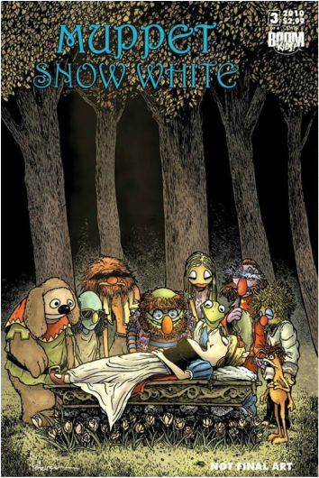
Muppet Snow White #3 Process:
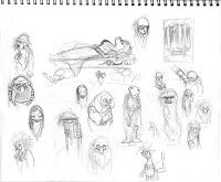
With the popularity of showing the Piggy Snow White cover process. I decided to show the same for cover 3. As before, it started with a small thumbnail sketch in my sketchbook (upper right corner). The potential cast list was pretty big for the funeral scene, so I focused on just sketching out mourning Muppets, not worrying about who went next to whom. Some character sketches I didn't like and redrew, others I passed over due to lack of space. 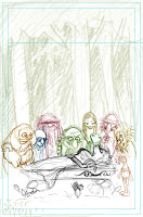
The sketches were scanned and sliced up in Photoshop. I had each character on a separate layer (the background trees were also on their own layer). Tinting the characters helps me know what lines are associated with which Muppet. This is the stage where I try and resize things or characters that are out of proportion. I can rotate heads or arms, re-center eyes, basically any minor changes. The order of the grouping was done mostly by height and what direction I had them facing in my initial sketch. If the arrangement wasn't pleasing to the eye, I could have mirrored characters to try and reorganize them.
The layout above was printed out at full size and taped to my final bristol board. I inked the cover on my light box using the printed layout as a guide. With the character's positions and faces, I followed my layout very closely. Other areas like the flowers as the base of the casket-platform, I inked as I went, just drawing variations of the few flowers I had sketched in on the layout. The leafs on the trees were also something I spent time on in the inking stage that were rather undefined in the sketch. It's that kind of varied repetition that I like doing in ink (rocks, leafs, water droplets...)

Last step was the color. I used a palette close to what I would have used for the Muppets anyhow, but I gave it a little yellow boost at the end to give the feeling of light coming through the canopy of that dark forest. With Spamela being the focal point I played with the lighting to make her some of the lighting source. The other trick was to push the background back behind the characters and not lose it in a muddy clump.
|
Mouse Guard had gained tremendous popularity at this point, and the fact that Archaia has the rights to Muppet comics was a perfect chance for David to step in and do some cover work.
I cannot even begin to count how many pages in my sketchbooks look like this one. It is always encouraging to see such a talented artist doing some of the same things that you are. Very reassuring. Also, who doesn't enjoy sketching some Muppets from time to time? I think I may start incorporating different colors for different characters when I print from Photoshop to help establish boundaries. This technique might also be beneficial for foreground, midground, and background separation. I love that David talks about proportion at this stage of his process. On a cover especially, proportion is so important. Little tweaks in Photoshop can go a long way. I am blown away by the depth and texture in this black and white image. Powerful and striking composition. Building up a textural knowledge in your head that you can draw from is important. For my next comic I learned a lot about drawing mountains and their corresponding textures. I like for my stories to have some kind of theme in that regard. The environment of a story is, as we all know, very important. Selecting a color palette is a skill that I am still developing. I like using the Adobe program to drop in professional images to learn more about color choices that the artist made. Color is a skill that requires a lifelong pursuit of dedication towards. David clearly knows how to build the mood into his color choices, but just like anything else this does not happen overnight. |
Conclusion: David Petersen is a class act when it comes to the world of professional illustration. I have nothing but admiration and respect for the work that he produces, and all that he contributes to the world of illustration and comics. I cannot recommend Mouse Guard enough to anyone who enjoys high quality storytelling, and if you are an aspiring artist his blog should be a valuable asset for you. I hope you enjoyed this humble commentary on the great information that David has compiled.
Thank You
A special thank you to Dave Petersen who allowed me to do this write up as long as I was "kind, accurate, and credit images/quotes." I hope that this article embodies that, and that he enjoyed this write up.
Biography
David Petersen was born in 1977. His artistic career soon followed. A steady diet of cartoons, comics and tree climbing fed his imagination and is what still inspires his work today. David was the 2007 Russ Manning Award recipient for Most Promising Newcomer, and in 2008 won Eisner Awards for Best Publication for Kids (Mouse Guard: Fall 1152 & Winter 1152) and Best Graphic Album – Reprint (Mouse Guard: Fall 1152 Hardcover). He received his BFA in Printmaking from Eastern Michigan University where he met his wife Julia. They continue to reside in Michigan with their dog Autumn.
Appearances
David will be making appearances at the following events and locations.
He is always happy to sign your books, do a quick doodle, or have a chat.
Check with the venue’s website for seating location and admission fees.
2016 Appearances:
C2E2: March 18-20
BD À Bastia (Corsica) March 31-April 3
Emerald City Comic Con: April 7-10
Heroes Con: June 17-19
San Diego Comic Con: July 20-24
Boston Comic Con: Aug 12-14
Baltimore Comic Con: Sept. 2-4
New York Comic Con: Oct 6-9
References and Links to Articles
Publishing and Art Credit
All of the images and articles posted on the lefthand side of this article are directly from David Petersen's Blog. These articles and images are posted of Dave's own volition, and belong to him. The content of these posts have not been alterated, other than for formatting purposes. David has his work published through Archaia, and his books are available for purchase from a variety of sources.
